Google’s big move to mobile is finally here — and no, we’re not talking about a new Pixel smartphone.
The company recently announced it was going to begin migrating sites that follow best practices for mobile-first indexing, a decision that will significantly impact the overall content marketing landscape.
We’re here to outline some easy tips to help ensure your content is checking all the boxes for Google’s mobile-first indexing rollout.
What Does Mobile-First Indexing Really Mean?
Before we get into the meat and potatoes of how to write content for mobile-first indexing, it’s important to understand exactly what it entails.
At its core, mobile-first indexing means Google will primarily consider the mobile version of your site on their search engine results pages (SERP) instead of the traditionally measured desktop version.
“Mobile-first” has been a digital marketing buzzword that’s gained significant traction in the last five or so years. That said, the industry reality has already evolved beyond that.
The current mentality should be “mobile-everything.”
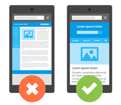
Strategies should be centered on how people will consume content from a mobile perspective. From viewing patterns to the ability to skim easily with clearly defined headings, content creators have to re-adjust how they think about content.
Following Google’s mobile-first indexing announcement, content will now be ranked by its engagement and customer experience on mobile. This means that every single piece of content should be analyzed and tested on a mobile device — not a desktop screen.
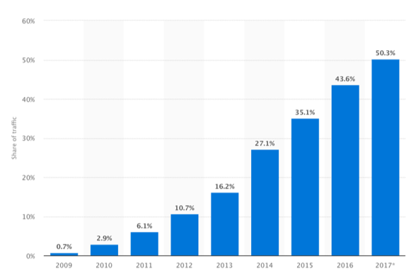
This is timely as mobile traffic continues to grow: 50.3% of all website traffic worldwide was generated through mobile phones in 2017. This trend has been on a rapid rise since 2009 when it was a mere 0.7% and it is expected to continue climbing.

Make Your Content Headers Count
Utilizing headers is a good practice in all forms of content writing, but it’s especially important on mobile. Having strong headers can really make or break a great mobile post because it’s generally where your eye is drawn to first on any given page.
A strong header will encapsulate what is going to be covered in the body of your post and allows your reader to be in control of what points they want to focus on while skimming through chunks of information.
They want to access the information they’re looking for quickly and adding headers is a fantastic way to do just that.

This is why all the best blogs include compelling headers. It’s an absolutely vital practice that serves as the real starting point to how your content will be consumed by the reader.
Headers are also an important factor when it comes to on-page optimization as they provide topic-related keywords and terms to strengthen SEO.
Use headers often to create easy-to-skim content that your readers will appreciate and Google will reward you for.
Create Easily Digestible Content
Writing long blocks of text on mobile will only cause more headaches for both you as a writer and, most importantly, for the reader.
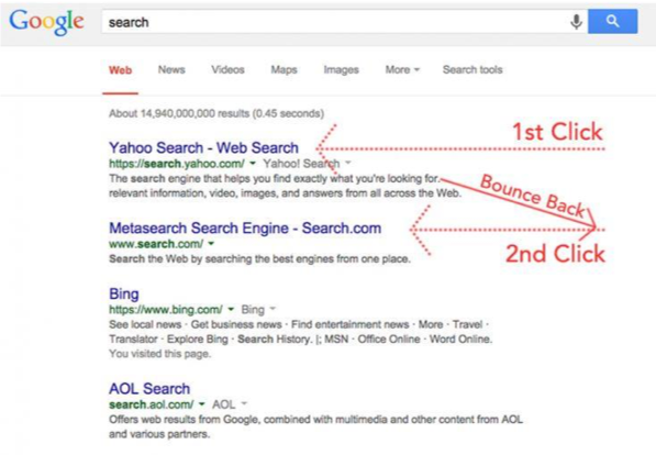
If someone lands on your site looking for information after conducting a Google search and they are bombarded with a 30,000-word novel then their immediate instinct is to go back and click on another Google search result instead.
This is called “pogo-sticking” and Google will decrease your ranking because of it. This is an important metric in the search engine’s algorithm — especially now with mobile-first indexing.

You should focus on writing small paragraphs with short and snappy sentence structures that aren’t extremely convoluted and are easy to follow.
Calculated simplicity is key when it comes to writing mobile content and you want to make sure that your ideas are channeled in easily digestible bits of information.
Utilize Images and Video in Blog Posts
One of the beauties of writing digital content is that you’re not limited to your words. There are a ton of great online resources for images and videos that can enrich your mobile content and give it added depth and validity.
Content that features images or video is more memorable.
In fact, people can remember 65% of consumed information after three days — this number drops to a mere 10% when the content doesn’t include a multimedia component.
Providing your reader with an infographic also offers them a compelling visual that is easy to internalize and gives them a break from longer runs of text.
Having a multimedia aspect to your content, such as infographics, also increases the likelihood that your piece of content will be liked and shared through social media. As a matter of fact, infographics get liked and shared 3x more on social media than other content.
Expert Tip on How to Write Content for Mobile-First Indexing
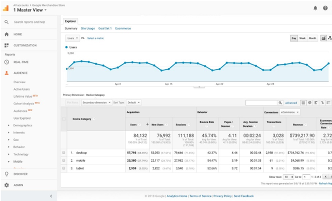
It’s helpful for content creators to analyze how different pages on their website are performing on desktop versus mobile to find any pieces of content that need to be re-written with a mobile-first focus.
To segment this data, go into Google Analytics > Audience > Mobile > Overview

This shows you a summary of website performance on desktop, mobile and tablet.
- Is the Avg. Session Duration higher on desktop than mobile?
- Is the Exit Rate Percentage higher on mobile?
These metrics can give you important insight into user experience on your website for different devices to help you analyze pages that may load slower, feature poor mobile experience or have blogs that are not written for people to read on smaller screens.
To specifically look at content or blog posts on your website from a mobile perspective, add a secondary dimension of Page to this chart.
Then add a custom dimension of Include > Device Category > Containing > Mobile

This will filter the chart data to show you website pages and their performance on mobile. You can then analyze metrics such as Exit Rate Percentage, Pages / Session and Bounce Rate per page based on mobile to help you find content that may need to be re-worked.
Conclusion
Now that Google’s mobile-first indexing has been rolled out, content is ranked by its engagement and customer experience on mobile.
As mobile traffic continues to grow, this is of utmost importance to marketers to make sure that every piece of content you publish is analyzed and tested on a mobile device- not just a desktop screen. Here are a few quick wins that will help you stay ahead in today’s mobile-first landscape:
- Utilize headers
- Create easily digestible content
- Always add images and video
- Use Google Analytics to segment your data in a way that’s easy for you to view on a daily basis
That’s it! Now get out there and start marketing with a mobile-first mentality!
If you’re looking to enhance your content for mobile-first indexing and strengthen your overall content strategy, sign up for a free Mintent account to access our industry-leading content marketing software or contact us to discuss your company’s specific needs.


